
BRANDING 2023
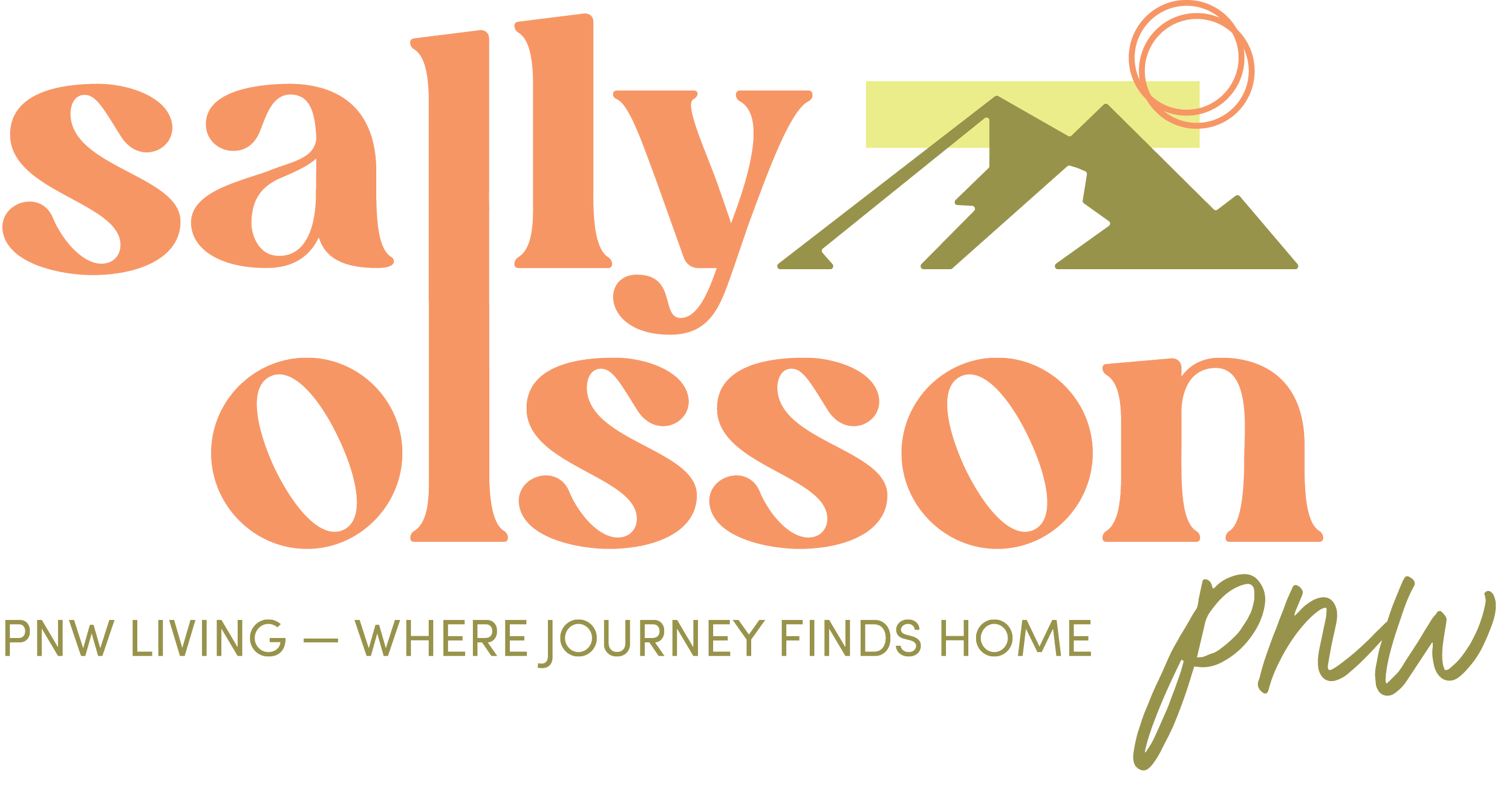
Sally Olsson PNW
We created a logo, color palette, patterns, brand voice and tone, and tagline for a real estate broker. These assets capture the essence of their brand words: Rooted, Integrity, Positive, Golden Rule, and Relational. The logo and color palette convey stability, trustworthiness, and authenticity, while the patterns symbolize growth and connection. The brand voice and tone embody integrity, warmth, and exceptional service. The tagline emphasizes the client's commitment to relationships and treating others with respect.
Brand Assets
We incorporated a beautiful illustration of a Portland Craftsman home surrounded by lush greenery, capturing Sally's deep connection to nature and her roots as a Portland native. These custom-designed thank you cards are a meaningful way to show gratitude for her clients.
Thank You Cards

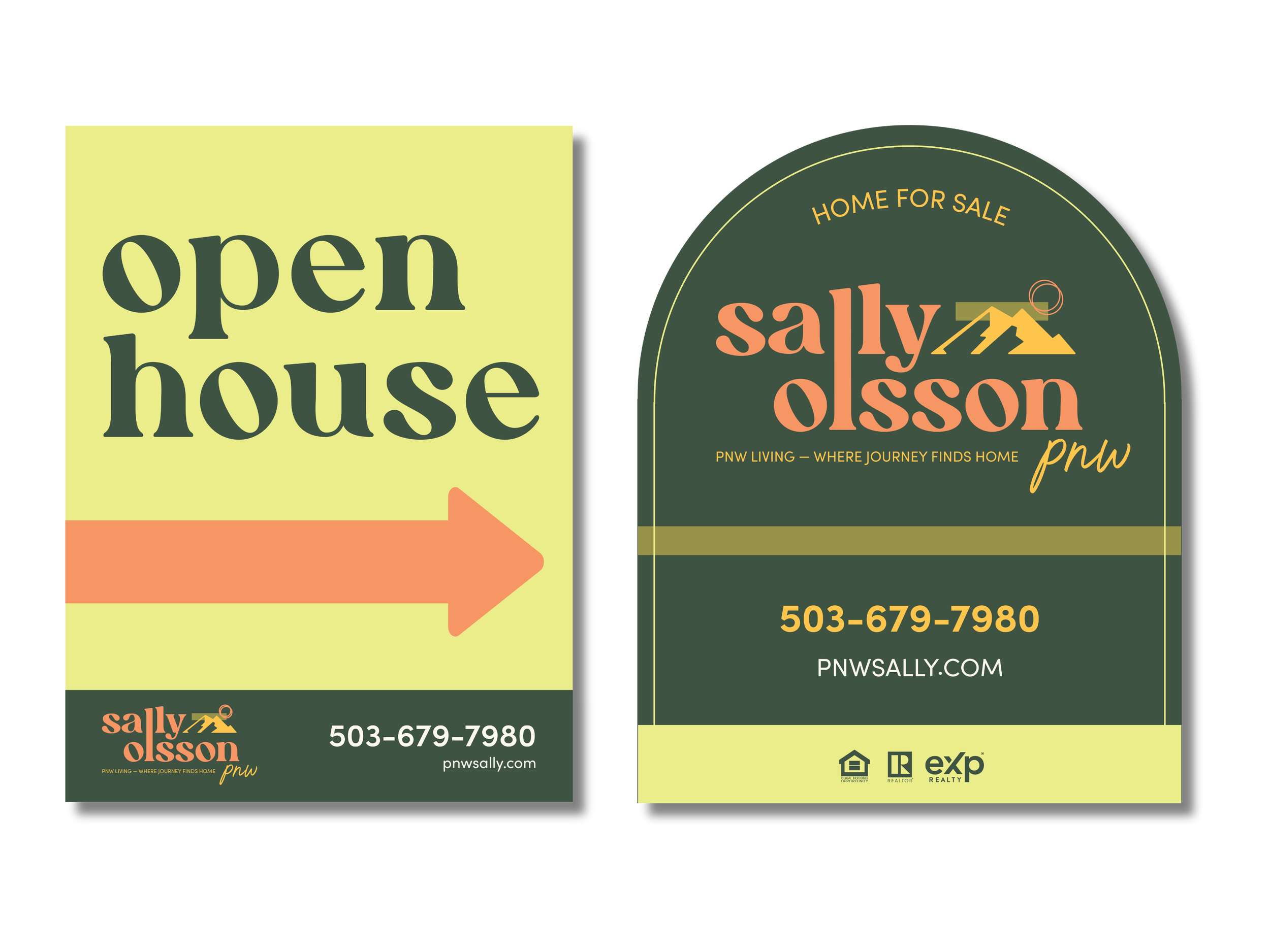
These designs are simple, impactful, and easily readable from a distance for potential clients. With the addition of an arch-like cutout design element, Sally's brand stands out among other realtors, adding sophistication and visual appeal. These custom-designed signs allow Sally to confidently showcase her properties and attract buyers with style and professionalism.
Open House & For Sale Sign
We have created a postcard design for Sally Olsson's branding, incorporating her leaf illustration elements and a simple pattern using her mountain element. The highlight of the design is her tagline, "pnw living - where journey finds home", which captures the spirit of the Pacific Northwest. This design represents Sally's brand and leaves a lasting impression.
Postcard Designs

The main focus of the card is Sally's headshot, which creates a strong visual impact. On the back of the card, her contact information is seamlessly integrated with the mountain element from her logo. This design showcases Sally's professionalism and her connection to the Pacific Northwest. With this business card, Sally can confidently network and leave a memorable impression on others.
Business Cards

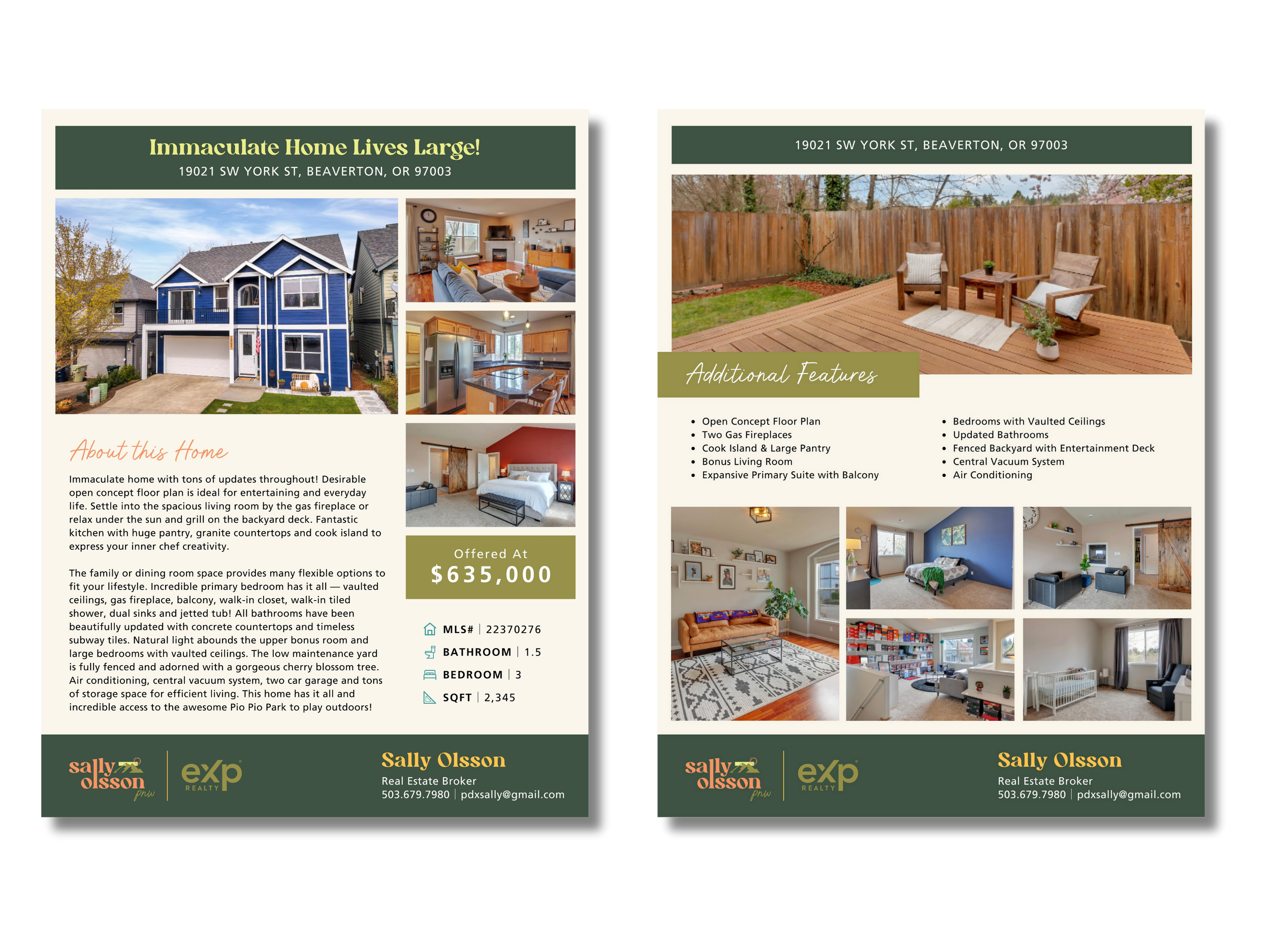
The main focus of the flyer is the photos of the home, which grab the attention of potential buyers. To maintain brand consistency, we incorporated color blocks from Sally's palette throughout the design. This visually appealing flyer effectively showcases the property features and reinforces Sally's unique branding. With this flyer, Sally can effectively market homes and attract interested buyers, making a lasting impression in the real estate market.
Listing Flyers
We designed a newsletter for Sally Olsson's branding that is simple and appealing to her audience. The header features a mountain image, reflecting her love for the outdoors. Throughout the newsletter, we incorporated her greenery color blocks while maintaining a balanced layout with ample white space. This design effectively communicates Sally's brand message and ensures an enjoyable reading experience for her audience.
Newsletter Design

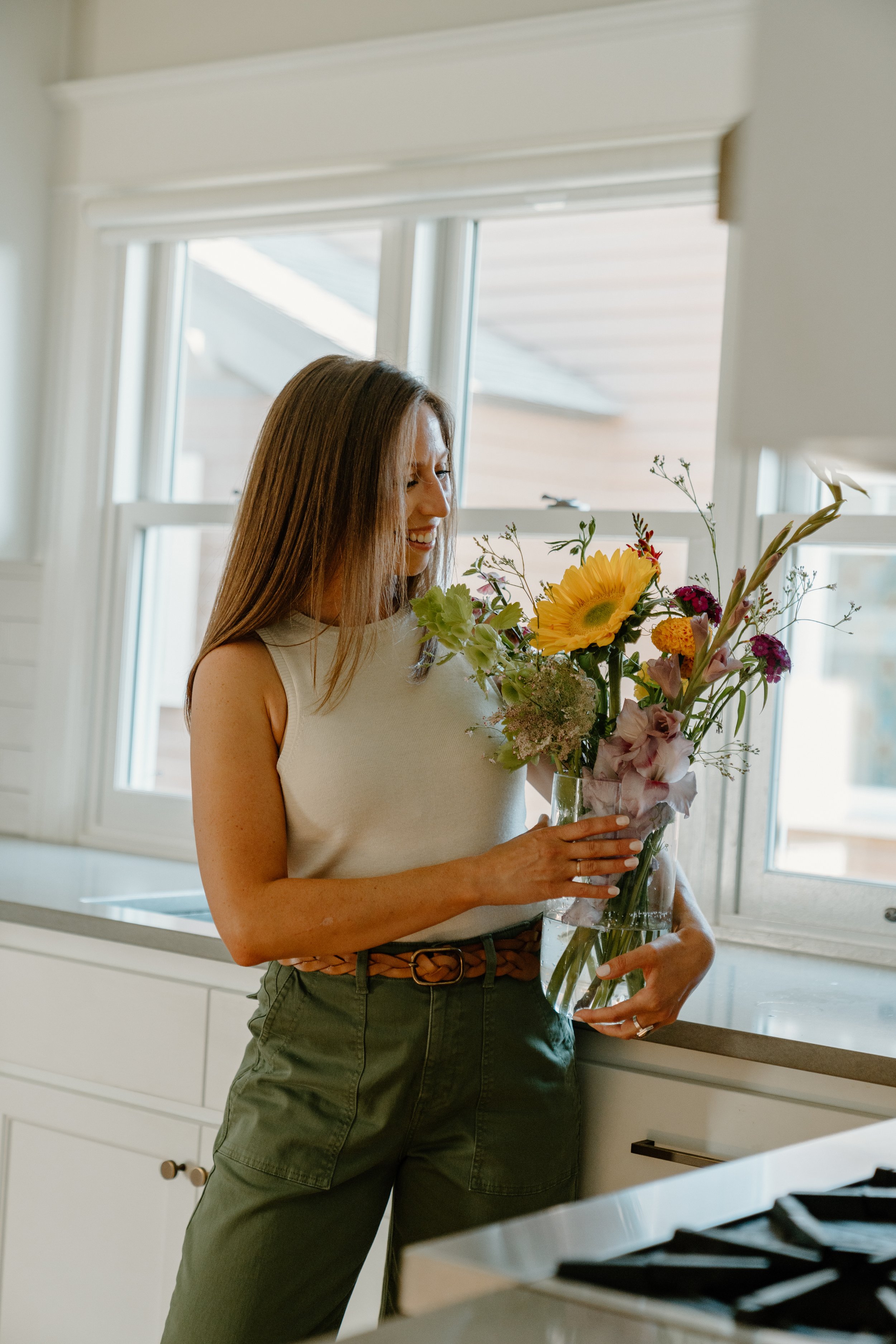
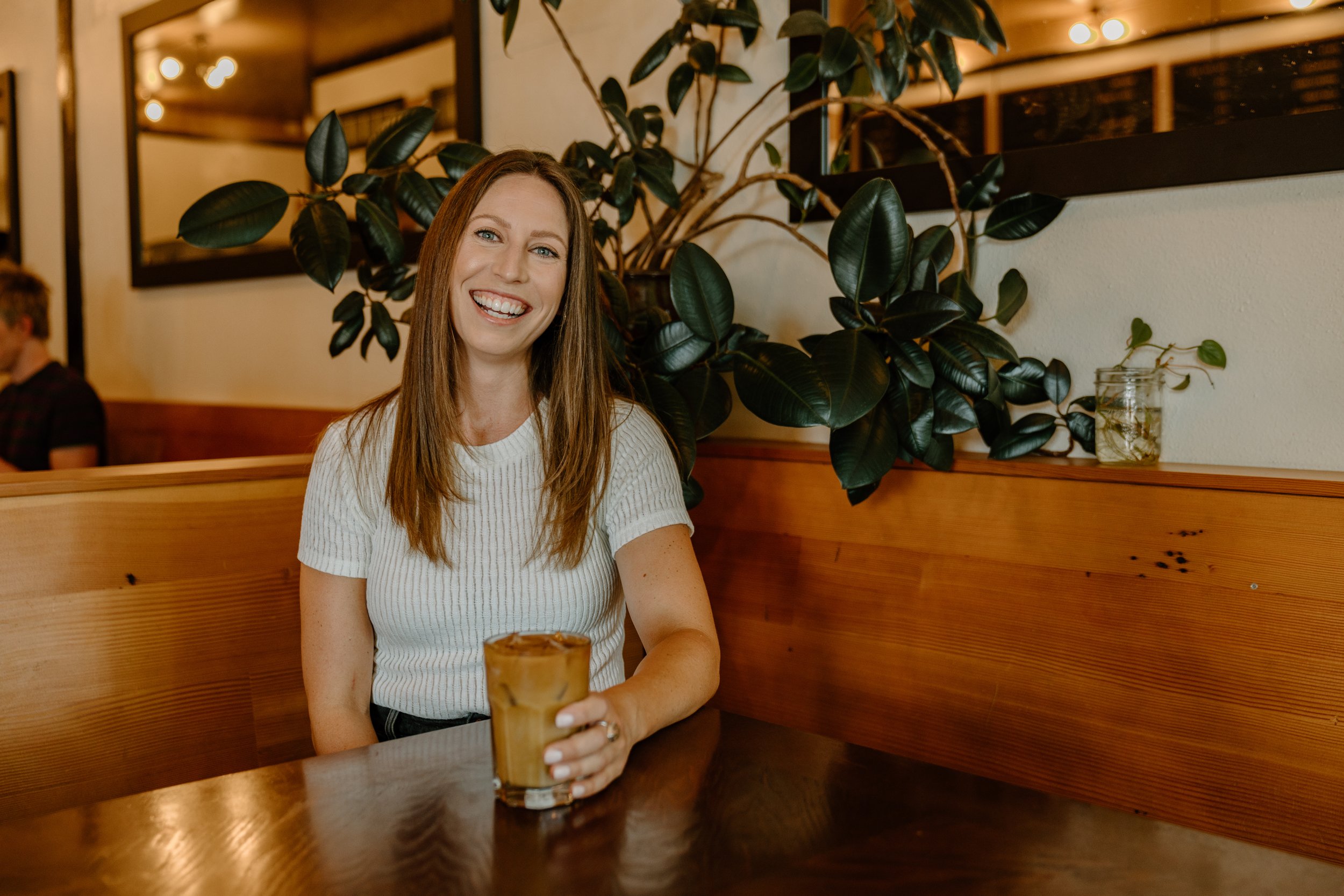
Photography - Content Session
We had a content creation session with Sally, and wanted to show off her quirky personality! The images are set as warm-toned, and saturated to give that retro look!